August 11, 2014
Dashboards – Mouse-over summary with drill-down different insightful piecharts and data exports. When using dashboards consider the balance between summary and detail.
Speed to Insight
A good dashboard will quickly present results that matter to your success. A great dashboard will then allow a simple mouse-over and drill-down to provide insights or the data you need to do additional analytics to get to the reasons for the results.
The best of Both Worlds
Drill-downs are intended to provide quick access to relevant data without obscuring the summary data. In management terms, the initial dashboard is the 50,000 foot view and the drill down zooms into a lower level of detail. More importantly the details are specifically related to the performance results that are of interest. Once identified a nice dashboard will allow a simple mouse click to the detail that you need.
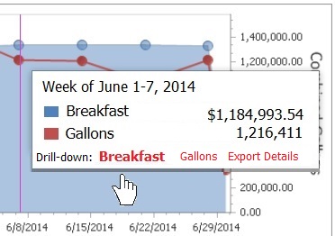
Different levels
A drill-down zooms into lower levels of detail. When there is a lot of data with either lots of stores, sales staff or machines it may benefit to break down into incremental levels. Here are three samples of how to use different types of drill-downs. Each level shows different insights that help find top selling items, stores, sales team or high quality machines. The data is there and different views show different perspectives.
Focus on one item – In this example breakfast is the item of interest. Sales for retail are very easily categorized. Here the next level shows how many of each type of breakfast item was sold. It is important to see the details of why sales categories are increasing or decreasing. The pie chart show perspective. Notice, however that too many items make the pie chart clumsy – it becomes difficult to match the color in the pie chart to the item in the key.
3-5 items show well in a pie chart
Many feel that a bar chart is better once the item count exceeds 5 or 6. In this example, the type of gas that is included in the total gallons is very clear.
Do it yourself
Sometimes we just need more analysis. Having the ability to grab raw data to analyze as you like or just print and share is really nice when you must get down to ‘ground level’.
Related topics
Creating dashboards that work for you
Convenience Store Performance Dashboards – Data Analytics Using Filters
Convenience Store Performance Analytics like Google Dashboard
Convenience Store Accountability Rules – Oh Yeah!
Convenience Store Performance Dashboards – KPIs with Drilldowns